Today, we'll be taking a look at how exactly image tracing is done in Adobe Illustrator. For the uninitiated, logo tracing is primarily done to sharpen old, blurry logos or to simply allow for easier redesigning later down the line. No matter what your reason is for doing it however, the method to doing it is still the exact same.
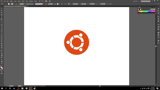
Step 1 : Get an image of the logo that you're planning to trace. Here, I've got an the Ubuntu logo, a nice looking and simple logo that accounts for most of the basic shapes. Great for beginners.
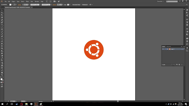 |
| The basic and simple Ubuntu logo |
Step 2 : Add a second layer to your work. This is essential, as it's basically what allows you to work om the traced logo without ruining the original. It acts as a safety barrier of sorts, and it's highly recommended.
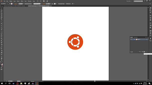 |
The 'Create new layer' button, essential to your work
|
Step 3 : Begin tracing the logo. There are multiple tools you can use, but for this post we'll be using the Pen tool. It's the basic tool, and can be used in any situation. There's also the Arc tool, which is very useful for arcs and circles.
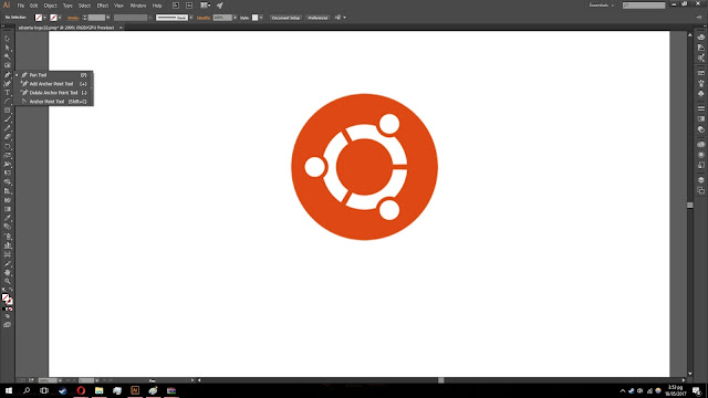 |
| The Pen tool, the bread and butter of Adobe Illustrator |
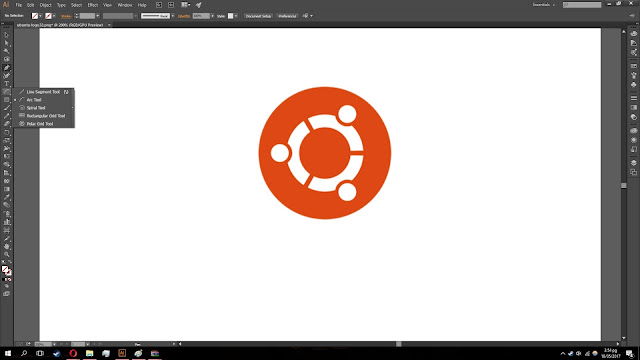 |
| The Arc tool, useful for curves, arcs and circles |
 |
| Traced the outline of the circle |
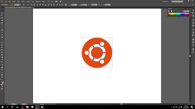 |
| Began tracing the elements of the logo |
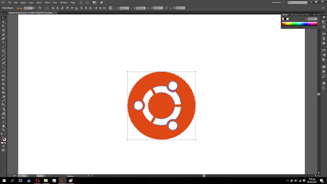 |
| The logo has been completely traced |
Step 4 : Once you're done tracing all the outlines, you'll want to copy the outlines and paste them. Then, use the eyedropper tool to copy the colours of the original logo and fill the outline. You should be left with a perfect version of the logo you chose.
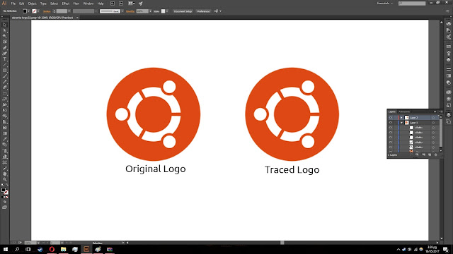 |
| Huzzah, completed work |
So as you can see, it's a very simple process. The largest problem is simply remembering what to do and when to do it, and once you get a solid understanding of what every tool can do, it's extremely easy. That'll be all for today, thanks.


EmoticonEmoticon